
Pirates of Lake Michigan: The Legend of the Undead Admiral
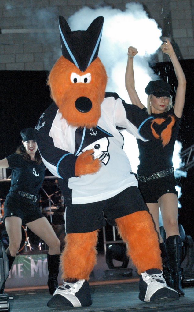
The Milwaukee Admirals unveiled their new logo, home and road jerseys, and a new color scheme featuring black, silver, and ice blue today at a party at the Potawatomi Bingo Casino Stage on the Summerfest Grounds.
“We are extremely excited to reveal our new look,” said Admirals Owner and CEO Harris Turer. “This is a new era for the Milwaukee Admirals and we want to start it off in a tremendous way on the 1st. We are thrilled to share this big night with all of our fans and sponsors.”
The logo, which was designed by Joe Locker of YES MEN, a Milwaukee ad agency, features an Admiral of a ghost ship with the tag line, “Never Say Die.” The logo and slogan come with quite an interesting story that traces the origin of the new logo, which, as it turns out isn’t new at all.
The Admirals new logo is actually and aged version of the team’s logo from the late 1970’s, a short young lad, who was lost in the waters of Lake Michigan back after the 1981 season and was recently found. The only thing that managed to keep him alive all these years was his fighting spirit. In fact, after one of his legs fell off, he used it as a hockey stick to hone his skills.
After over 25 years of being underwater, the red white and blue uniform had faded to the black, silver, and ice blue, and had turned his fresh young face into a skull. Despite all of his changes, his fighting spirit never wavered and that relentless spirit and tireless work ethic have given us our new battle cry: Never Say Die!
A pirate came out over the Pirates of the Caribbean soundtrack and introduced the new logo and the story behind it.
The logo is the fourth in the history of a proud franchise, and whether you like it or not, it's an attempt to update and urbanize the marketing appeal of a minor league hockey sweater in a town which sees itself as a major league market.
Gene Mueller of WKTI was the Master of Ceremonies tonight. It was held with great fanfare, lights and smoke as well as a fashion show style presentation of the new uniforms and liscensed apparel.